Brand identity
DOC NIL | Brand Identity Built on Proportion
An identity and website for DOC NIL, the brand identity studio within the DOC N.I.L. family.
Visual language
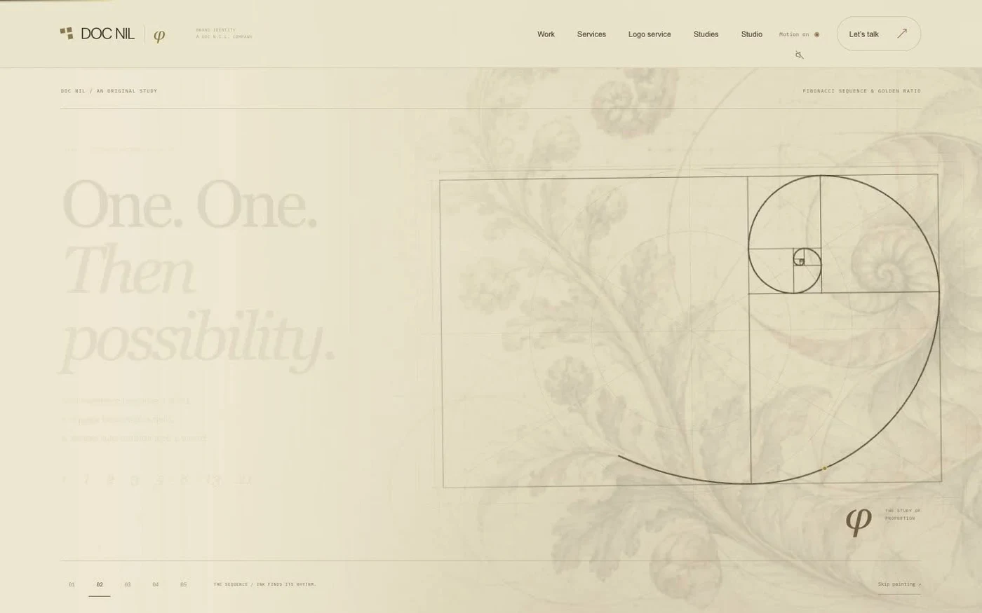
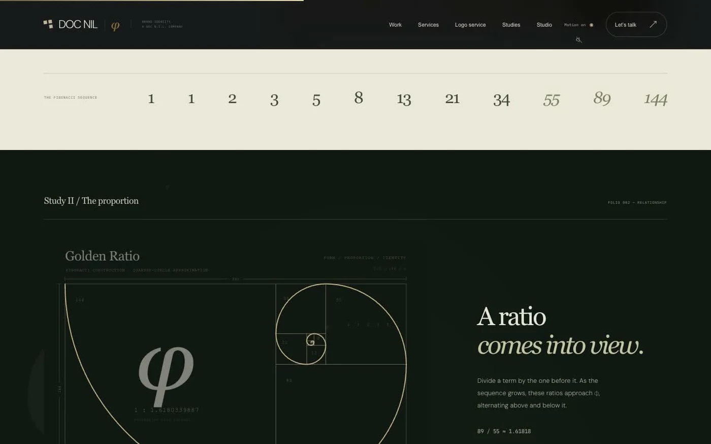
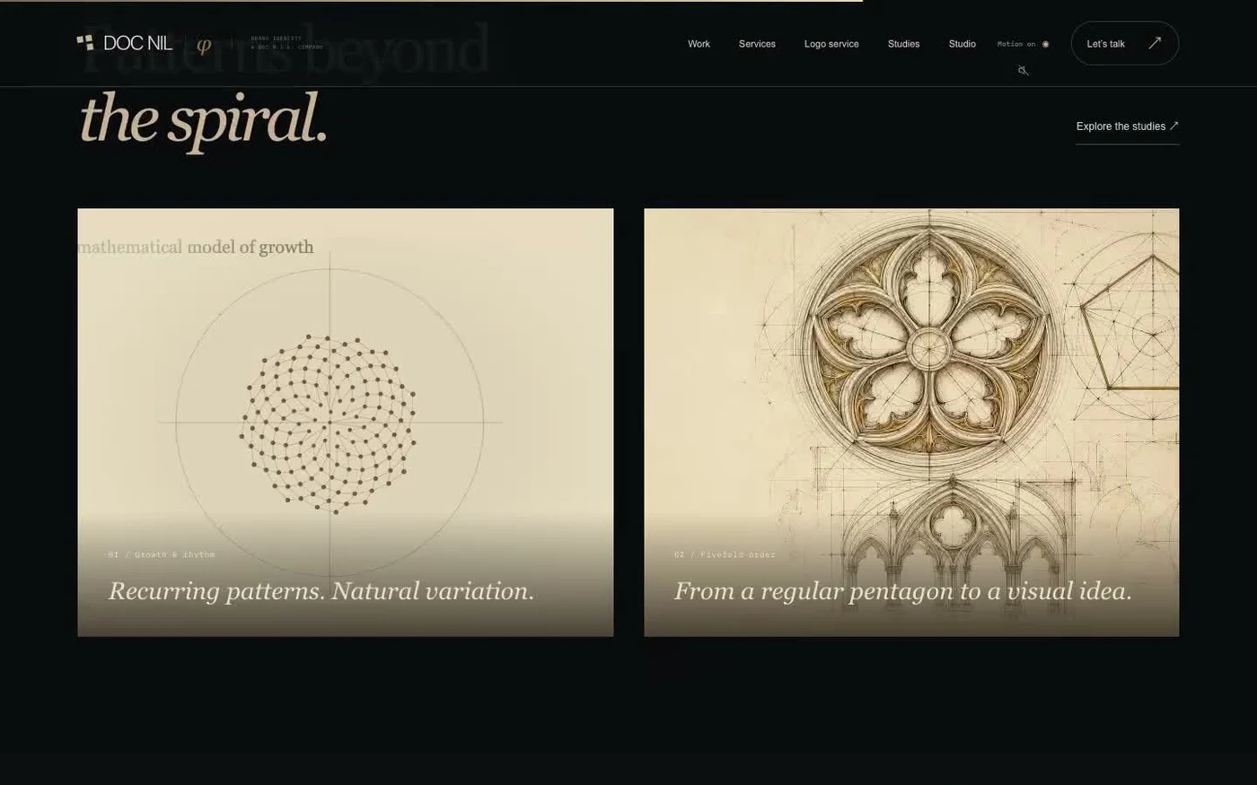
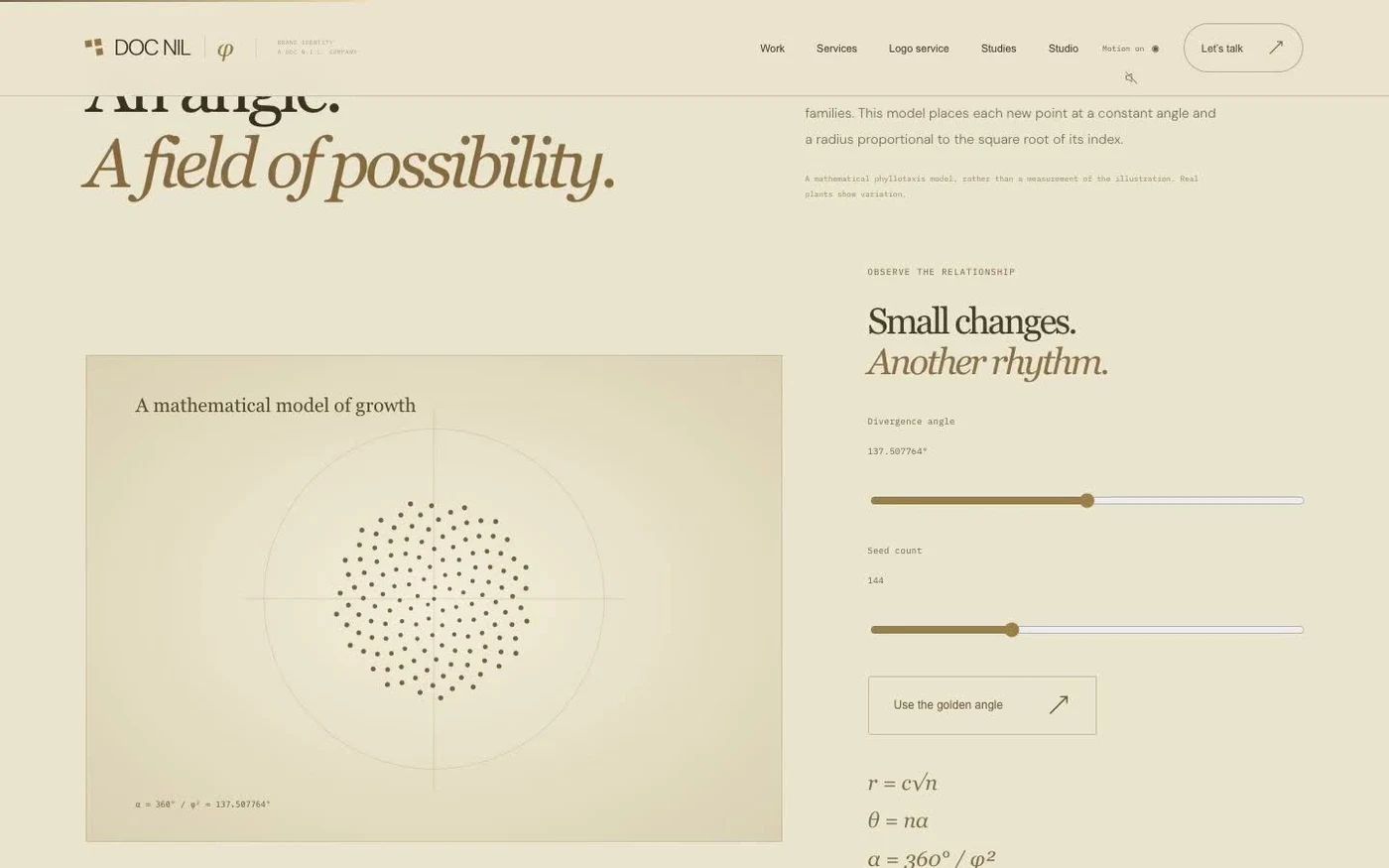
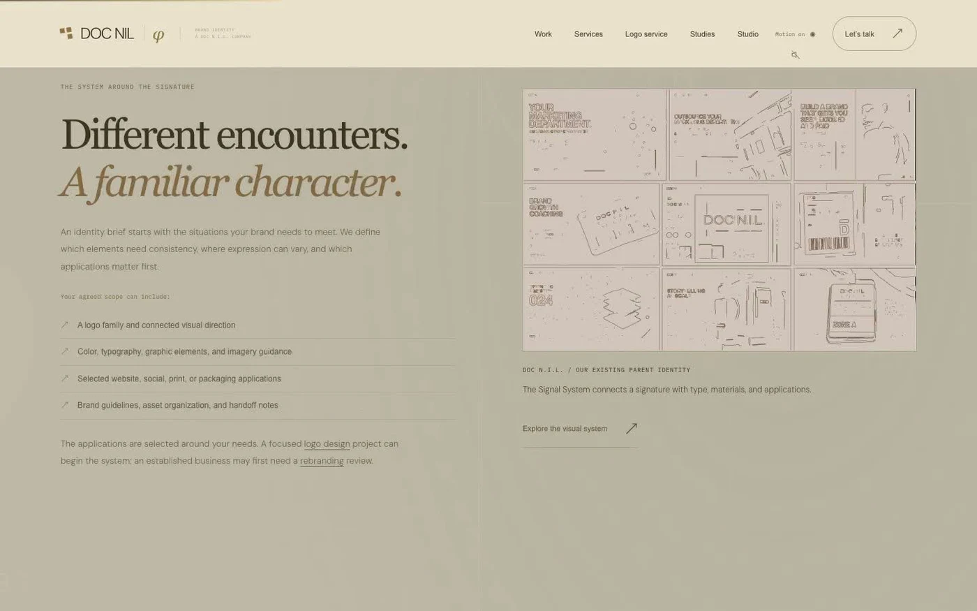
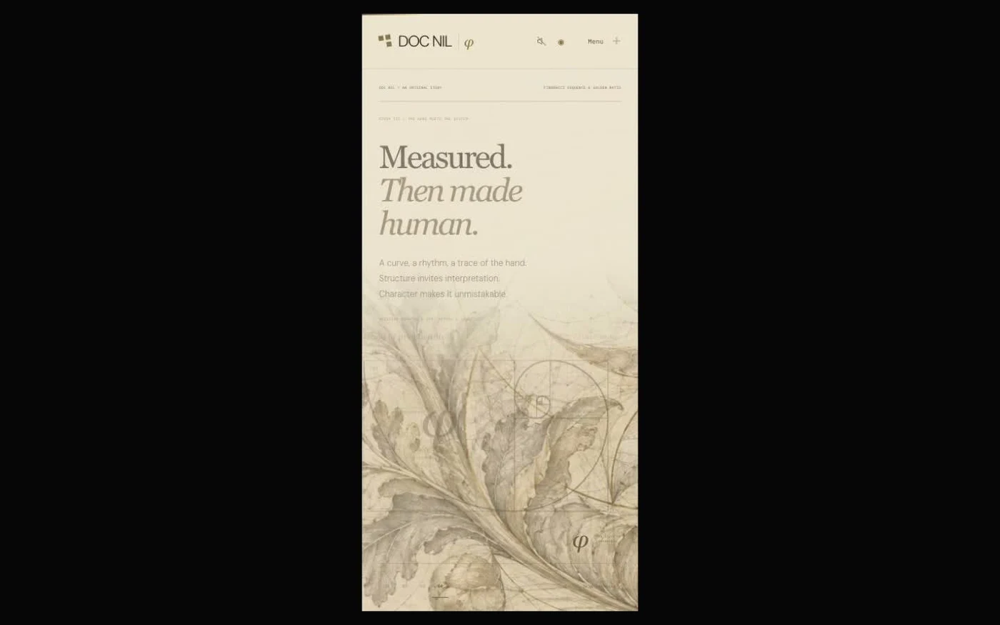
The site presents proportion as an exhibition, using paper tones, gold, serif typography, and scroll-led studies alongside the Signal System. It shows marks progressing from sketch to finished form.
Proportion studies
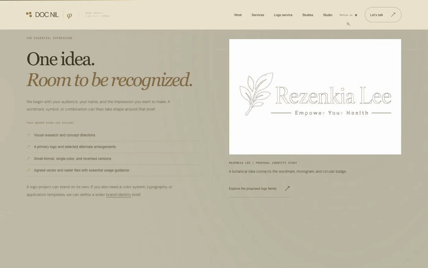
Golden-ratio and Fibonacci drawings are part of the studio’s design exploration. The exhibition also includes the proposed Rezenkia Lee identity.
Brand resources
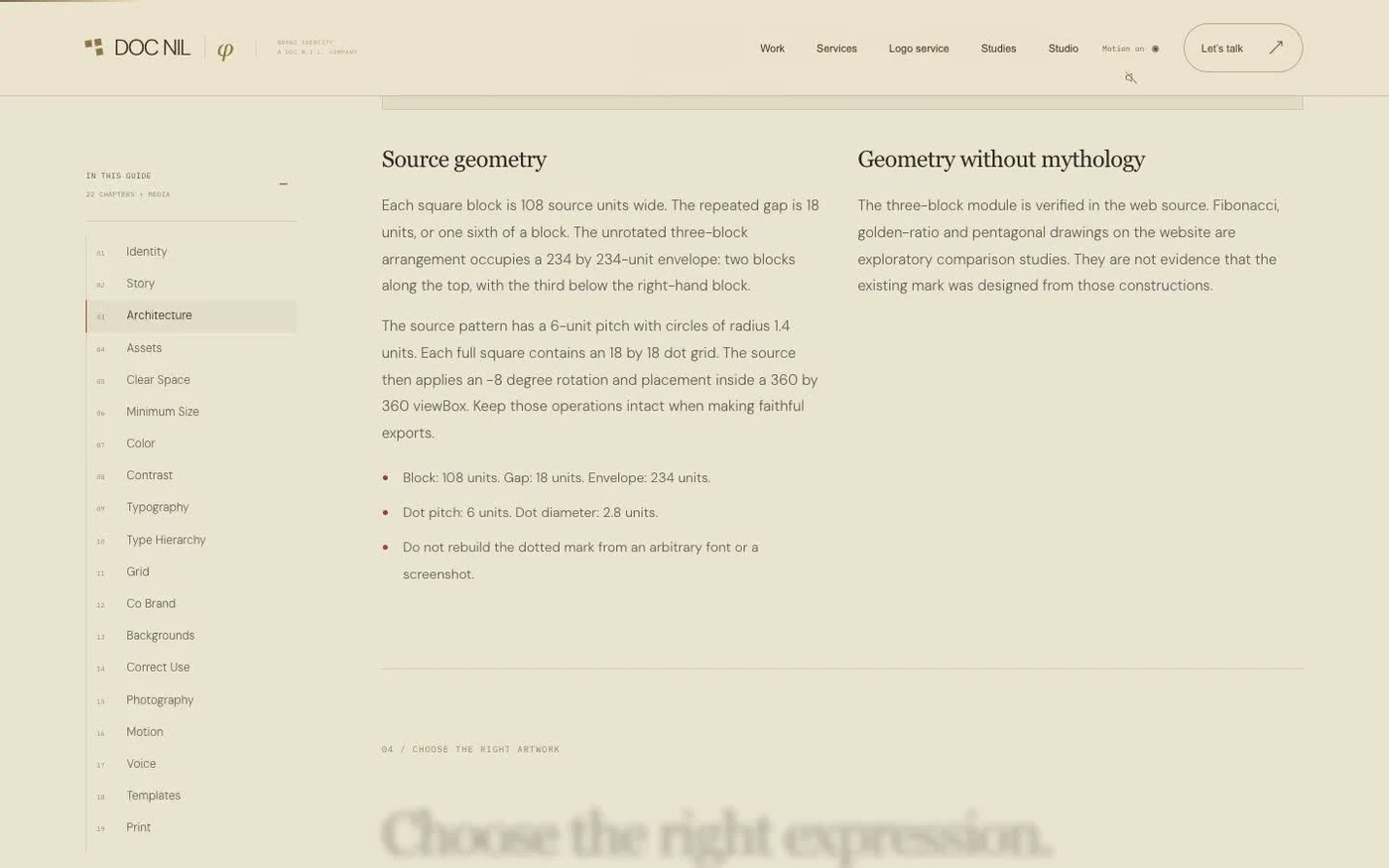
The case study documents a 22-chapter brand guide, 87 media files, and page-level search setup.